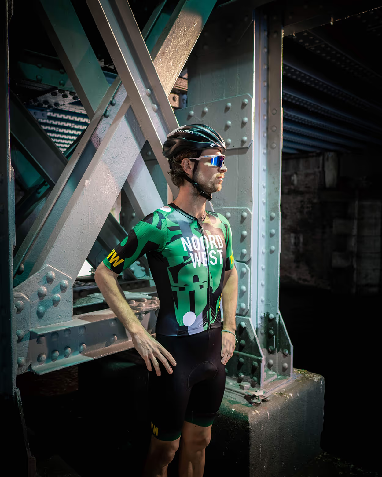
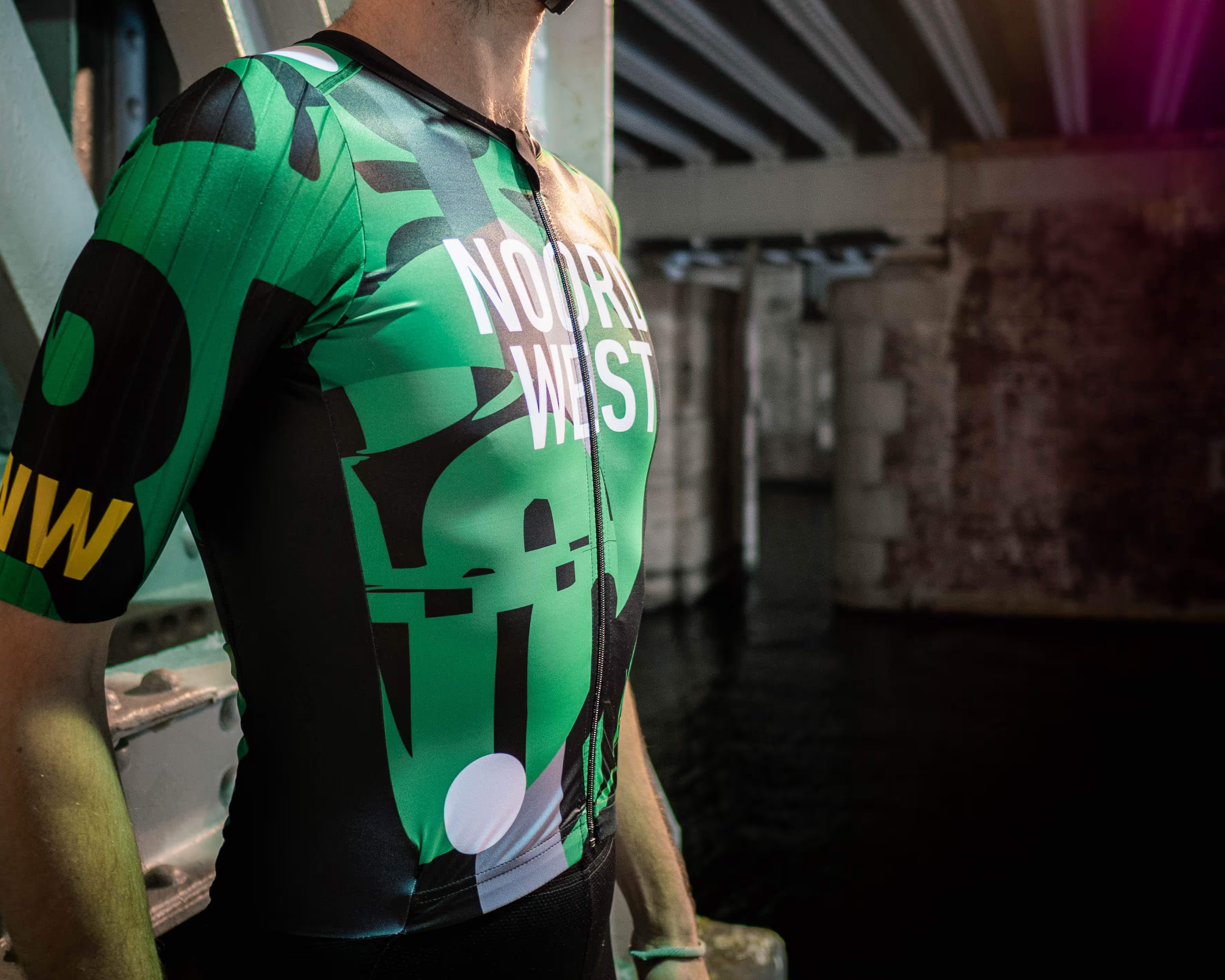
Suffering in style. A bunch of friends joined a cycling team and wanted a cool jersey, to stand out in the crowd. End of story, just kidding. Inspired by street fashion, graphic design & (displacing) typography.
project info
Most of the boys in the team have a creative background. They mentioned a desire for a jersey based on or inspired by type. I came up with a couple of proposals of fonts we could use as a basis for their cycling outfit. We quickly aligned on a specific version of DIN and me being a German, the jokes came in quickly.
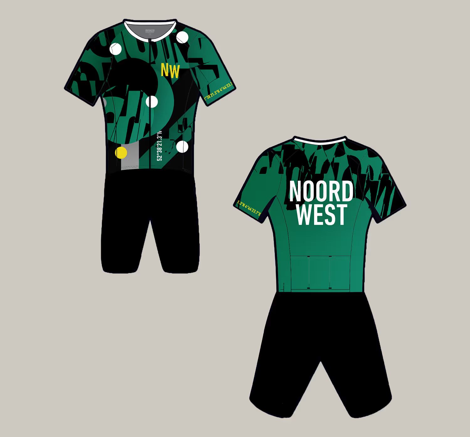
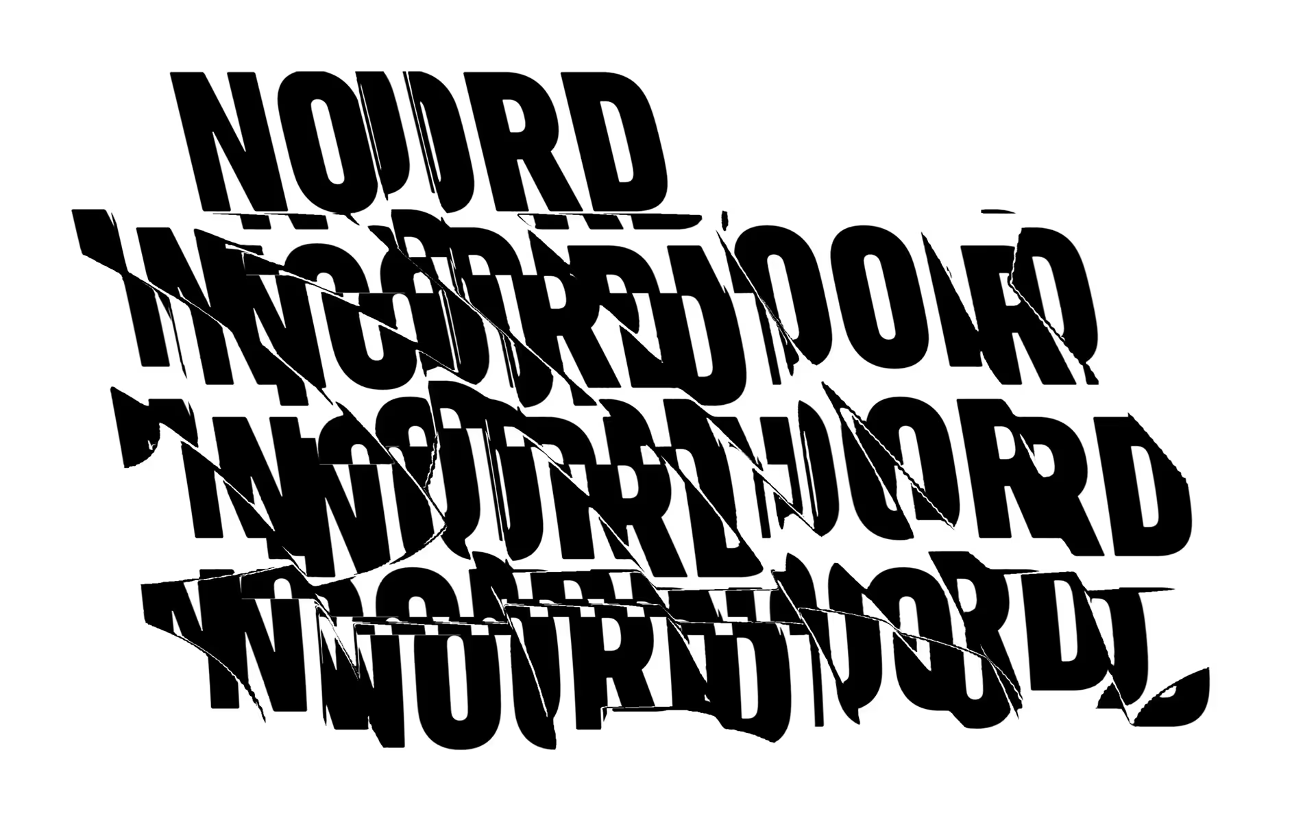
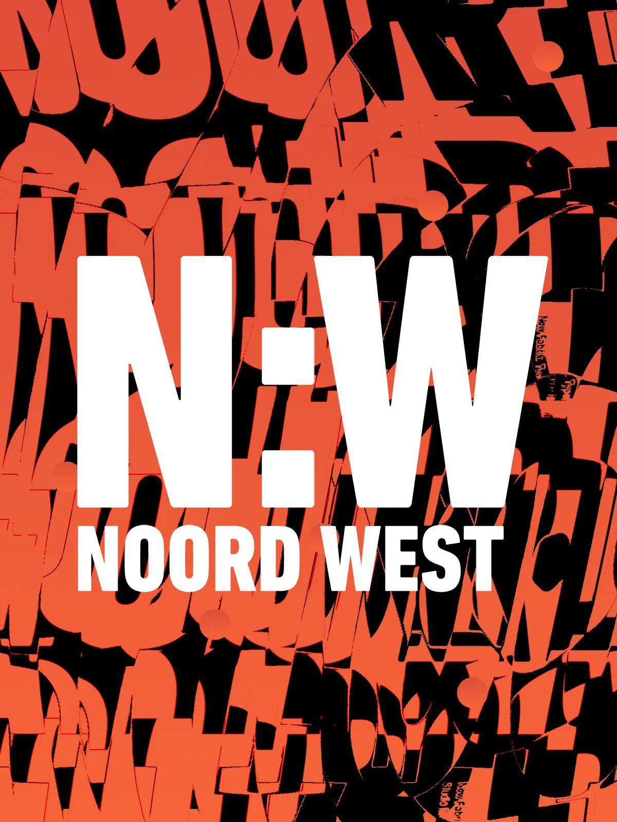
I’ve designed a very simplistic logo, based on the cycling associations name. This quickly turned out to be the foundation of the whole design, as I’ve used displacement techniques to manipulate the type and use it as graphical element in the design itself. As a fun little detail we added the coordinates of the club house on the jersey as well.
role
I had full creative responsibility. This was a passion project and as such I took it upon myself to inspire the cycling team to go for this direction, based on their desire to stand out in the (cycling) crowd.
We iterated on a few different concepts, based heavily on typography and ultimately ended up with bold green, black and yellow colors and heavily displaced typography.
tech
- Illustrator
- Photoshop
credits
- Alexander Munz (creative direction, design)
- Jari Kloppenburg
.avif)
