geldmaat
Geldmaat is making cash accessible across the Netherlands, with the ambition to reshape the ease of use of how money moves.
project info
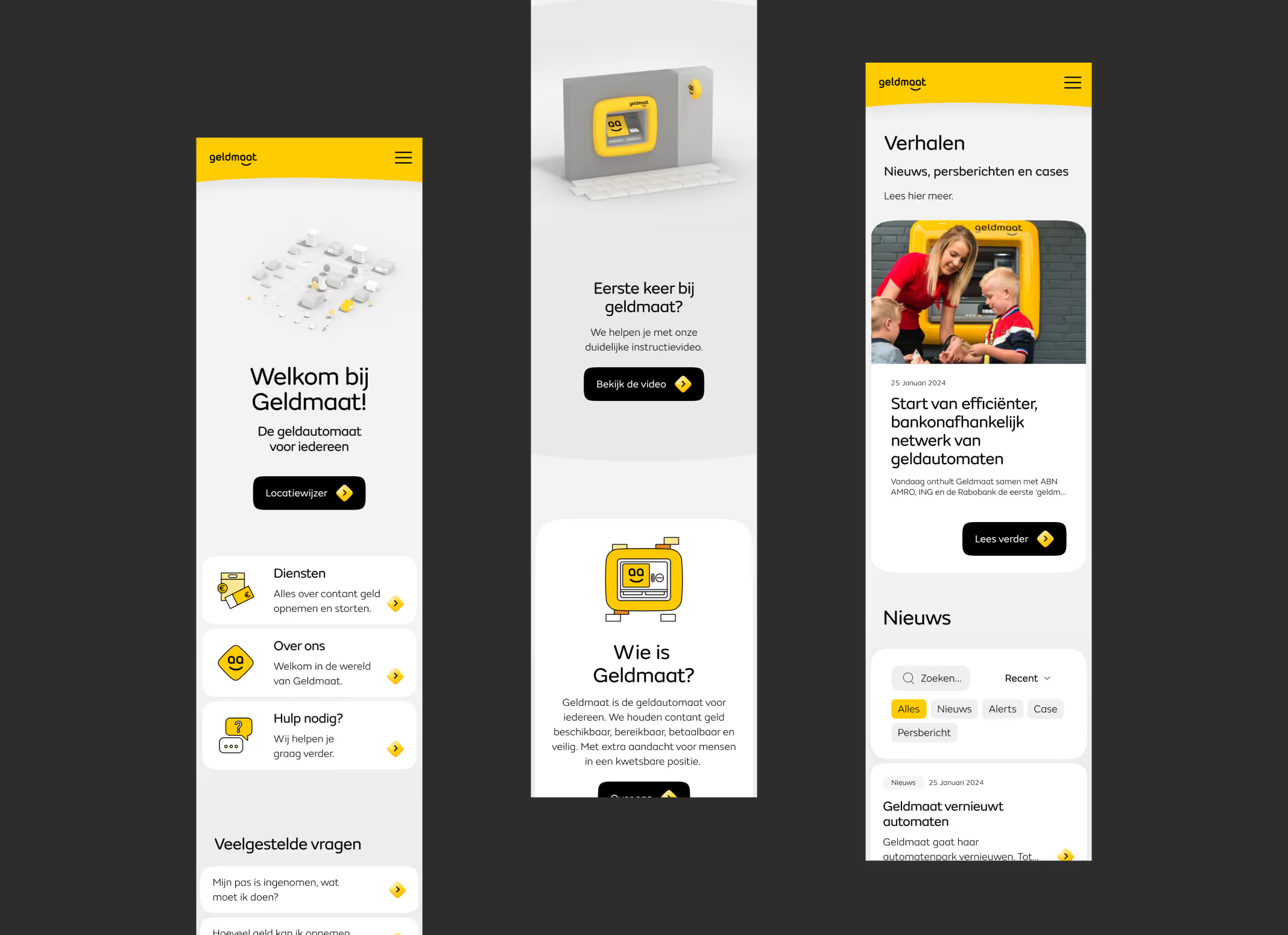
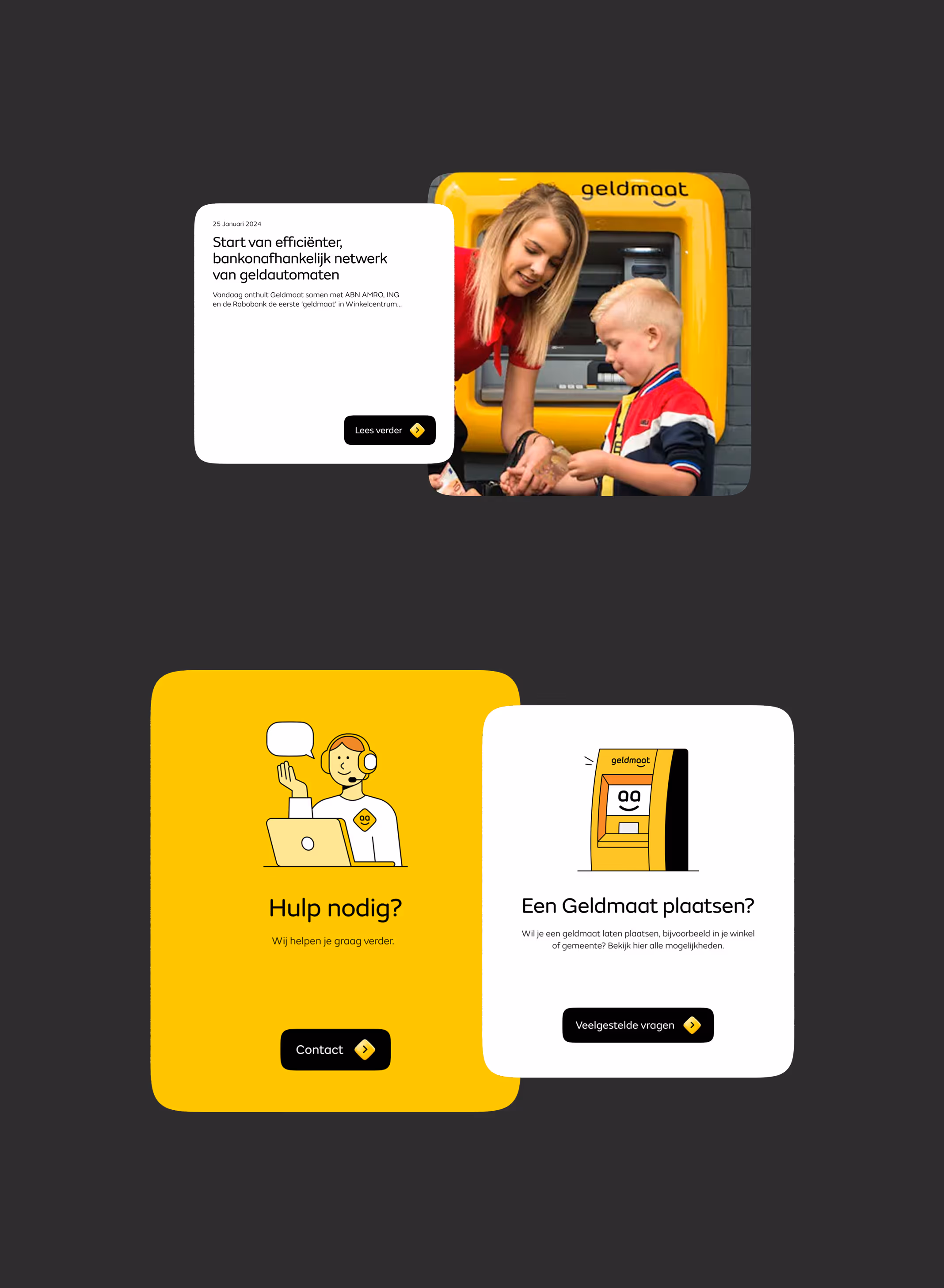
The previous Geldmaat website was launched in a rush and over time turned into a patchwork of fixes and new content types. It became harder to maintain and even harder for users to navigate, which meant simple information was difficult to find. As a result, the customer service team was left answering questions the website should have solved on its own.
For users, the right information was technically there, but it was hidden in lengthy, inconsistent content. This often left people distracted, confused, or unsure of what to do next
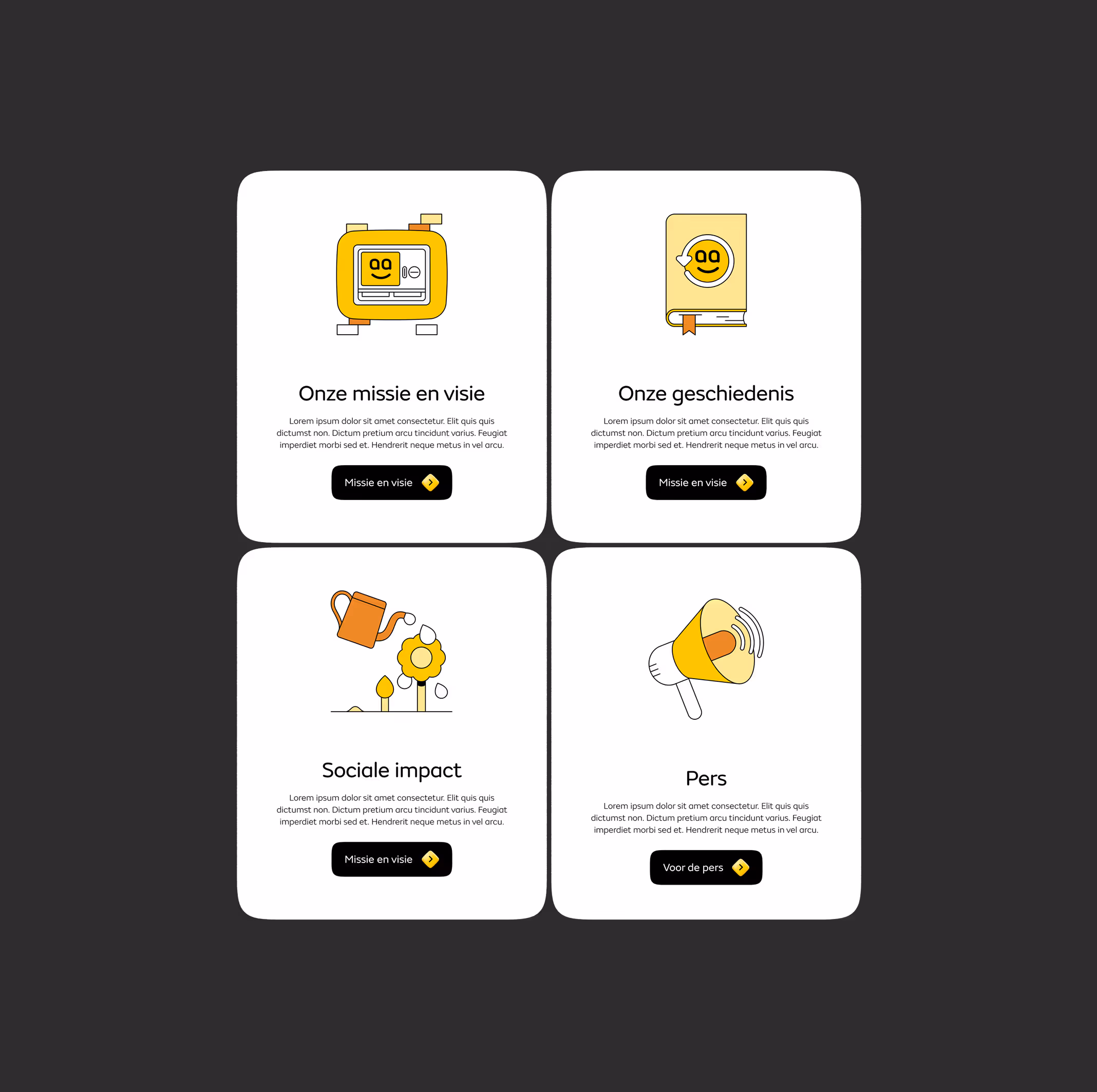
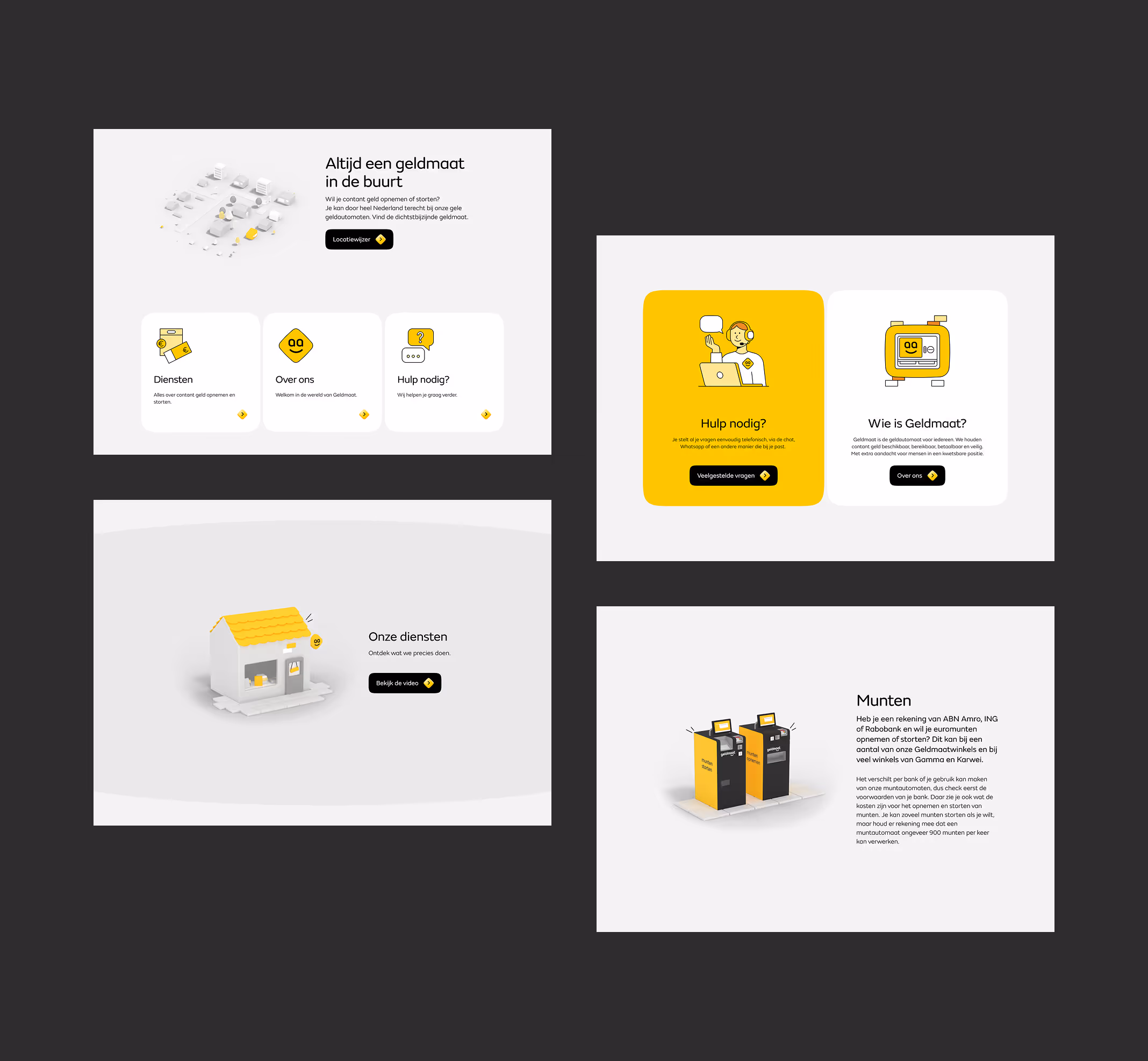
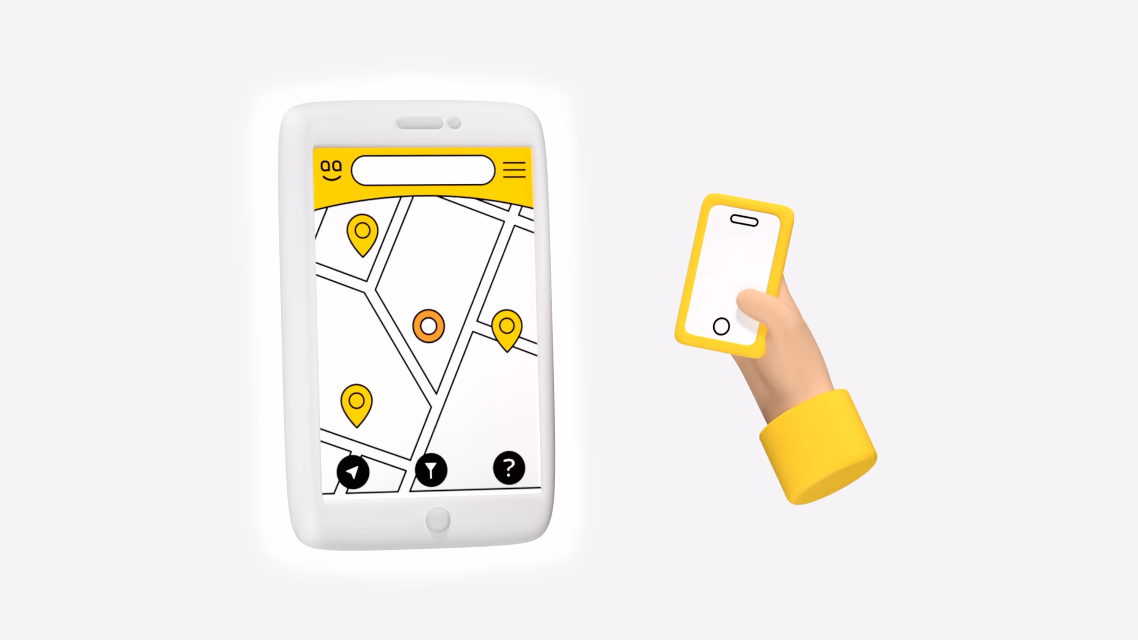
Through research we discovered that most website visitors aren’t frequent ATM users. Regular users usually head straight to the Locatiewijzer (location finder), often skipping the rest of the site entirely. We also saw that different user groups have very different needs. Six main audience types were mapped, but more testing after launch would be needed to refine their journeys further. One thing was clear: the Locatiewijzer is by far the most visited part of the website, and integrating it more seamlessly would be key to creating a smoother, more useful experience.
Our approach was guided by three design principles: accessibility for all, consistency, and reducing cognitive load. These principles helped frame the key questions we needed to answer together. How could we keep the website simple and clear while still providing different types of information to diverse users? How could we maintain a consistent experience while addressing the unique needs of each audience? And finally, how could we make the site both attractive and accessible—visually and technically—without losing a sense of professionalism?
role
From the very beginning I guided the team across different specialties, from strategy to design, and carried responsibility for the project’s overall output. My role was to guide the team in shaping ideas and communicating them clearly to the client and to the users of the refreshed website. When needed, I stepped in hands-on—designing myself or supporting the team with open tasks—to make sure everything moved forward smoothly.
tech
- Figma
- Illustrator
- Blender / Cinema 4D
- After Effects
credits
- Alexander Munz (creative direction)
- Yes de Jong (design)
- Maaike Ruigrok (illustration, 3D, motion)
- Paul Goos (illustration)
- Evert van der Veen (motion)
00:00
/
00:00